
OVERVIEW
Charitize is a marketplace where volunteers can donate their skills in exchange for a donation to a charitable organization of their choice. An interested buyer from the same community can purchase these services with all of the proceeds going towards charity.
BACKGROUND

CHALLENGE
Taking this business model, our team's goal was to build the entire user experience from scratch, create a brand identity and deliver the MVP as a web-based platform within 6 weeks.
ROLE
I worked on the entire end-to-end process as a researcher, product and brand designer. My main responsibilities were to develop a brand guide and to design the experience for the Organization and Cause pages.

BRANDING
BRAND WORDS
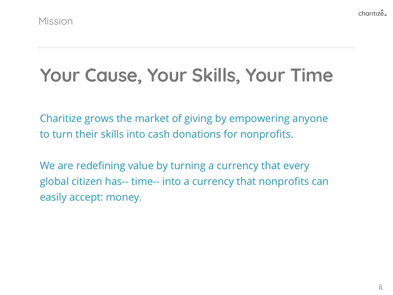
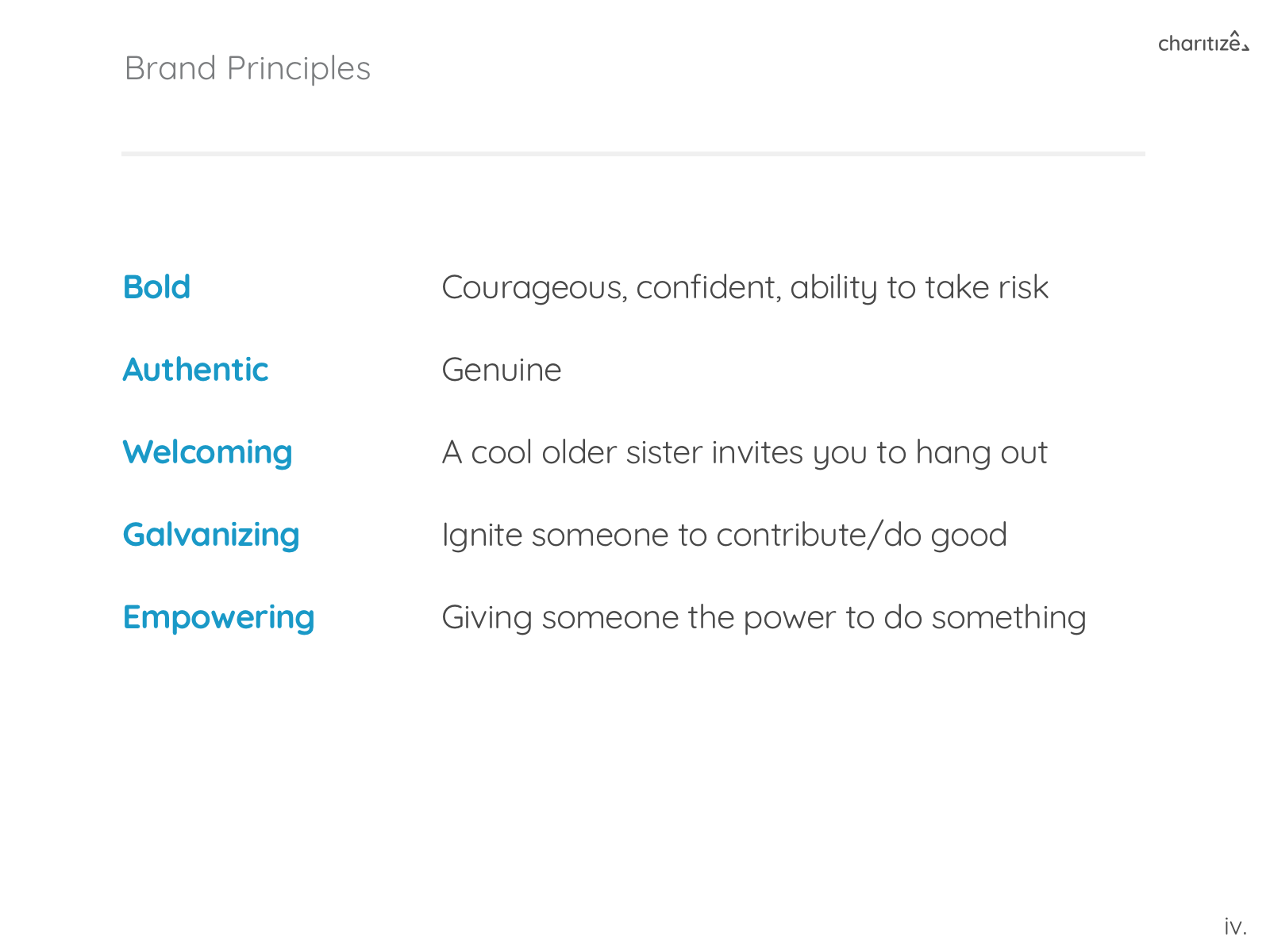
To start, we ran an exercise with the founders using a brand deck to have them pick words that would represent the values of Charitize. After some further brainstorming, the five words they picked were:
- Empowering
- Welcoming
- Authentic
- Emotionally Galvanizing
- Bold
From there, we created a comparative analysis deck of existing websites that we thought embodied each word. The founders gave us back notes for each of the examples on what they liked and what they didn't. We began to understand their vision and had a starting point for building the visual identity of the product.
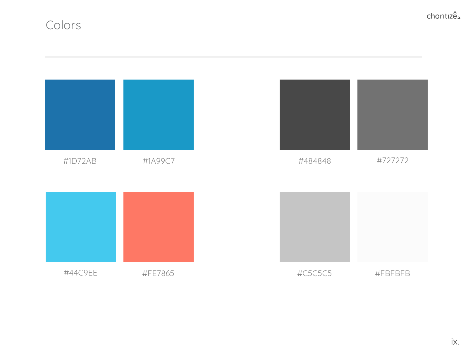
STYLE TILES
The next step was to hone down on visual elements like typography, color and imagery. We diverged and began developing our own style tiles, choosing 3 out of the 5 words for each tile. The final style tile below was approved by the founders with all of the colors passing accessibility guidelines.

This was the final style tile approved by the founders with all of the colors passing accessibility guidelines.
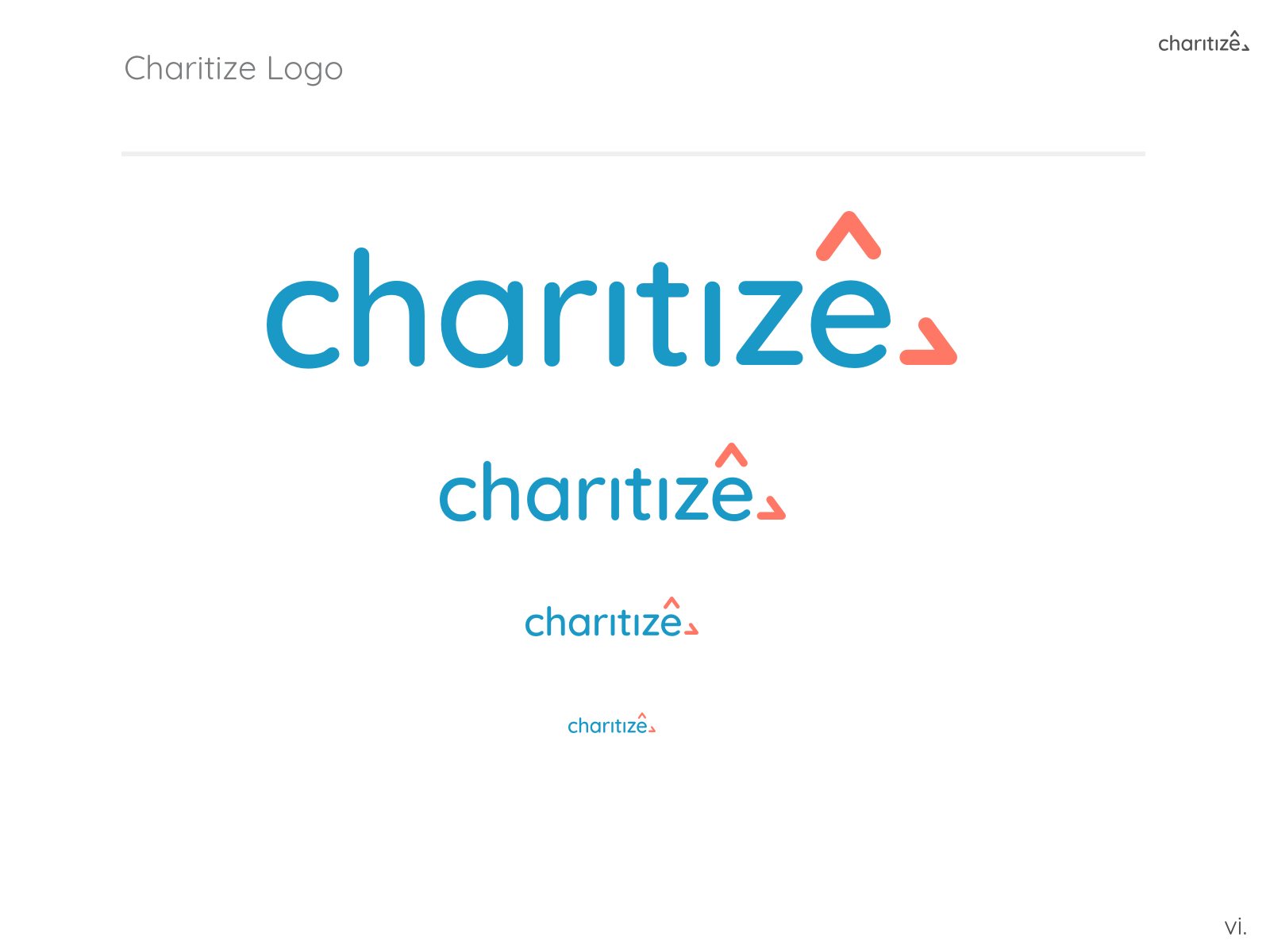
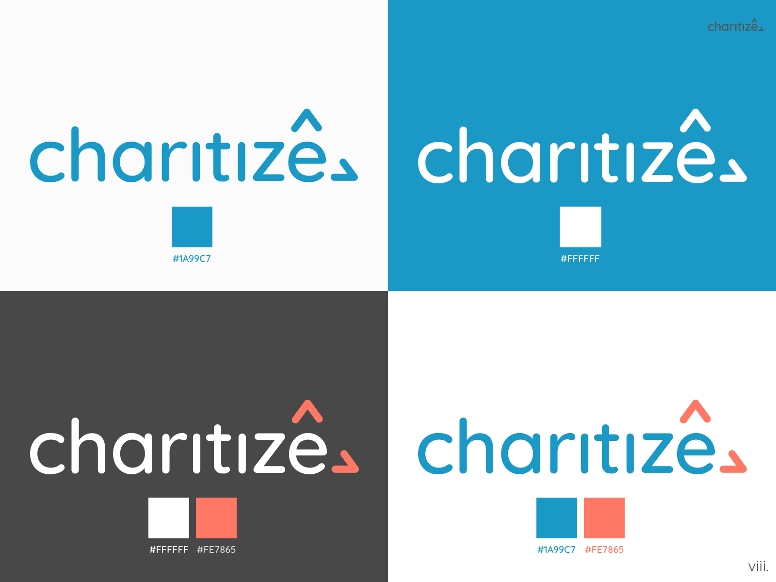
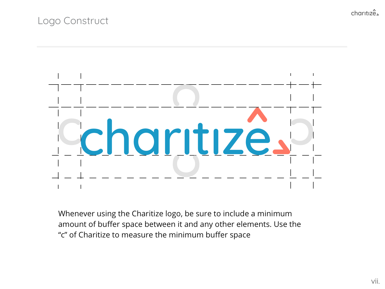
LOGO
The client expressed an interest for simplicity and asked us to explore the brand's values in a subtle way. Again our team diverged and we began conceptualizing.

After a few iterations, the founders chose the final design below. Using the negative space in the z, the triangle represents the three sided marketplace. They also felt the font had a friendly yet reliable characteristic to it.

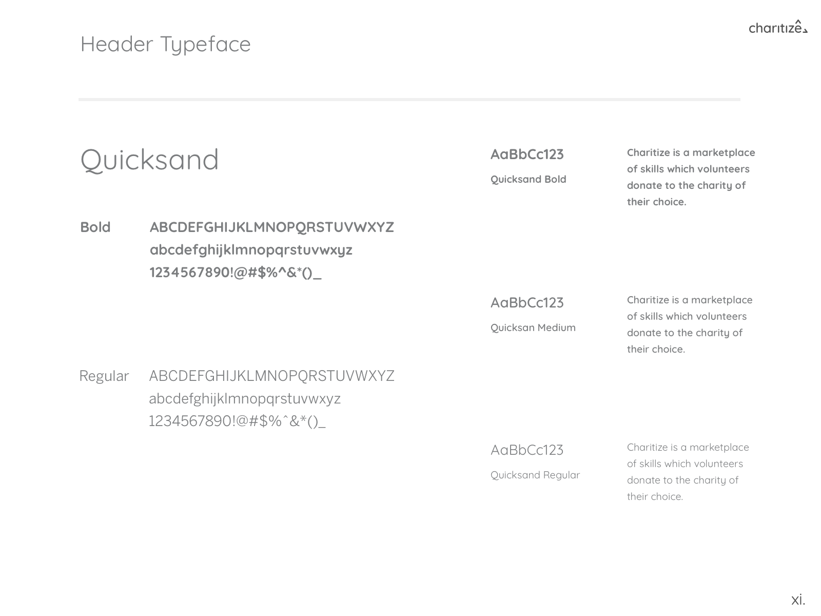
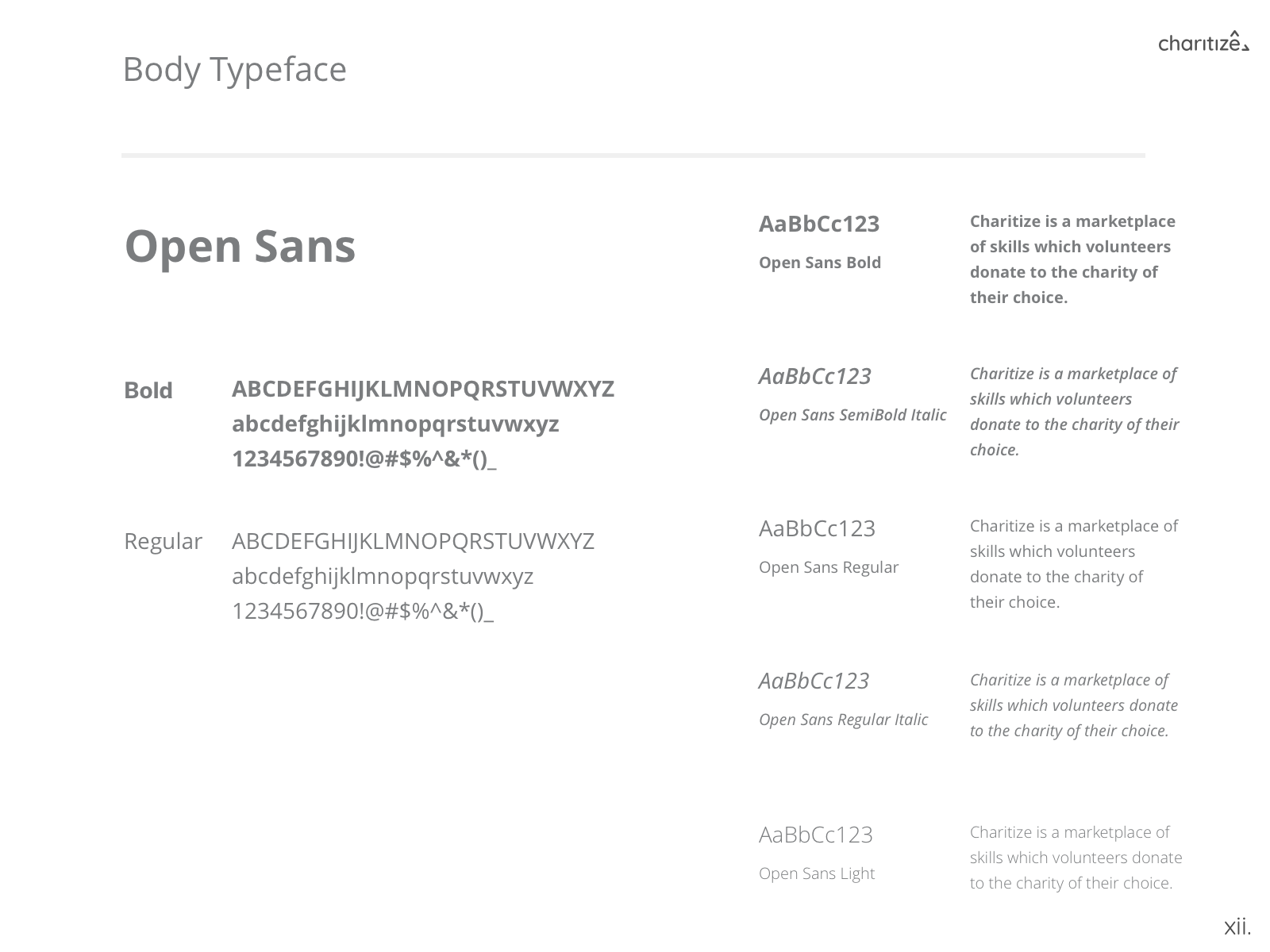
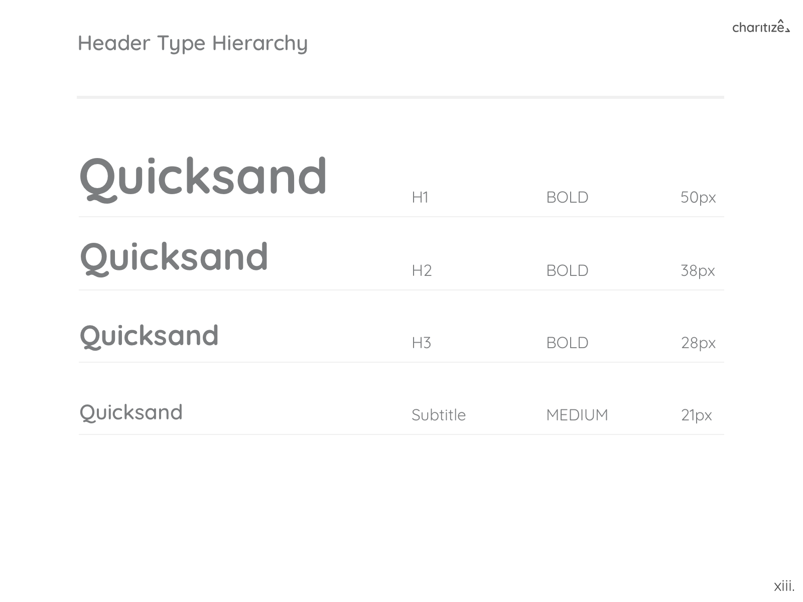
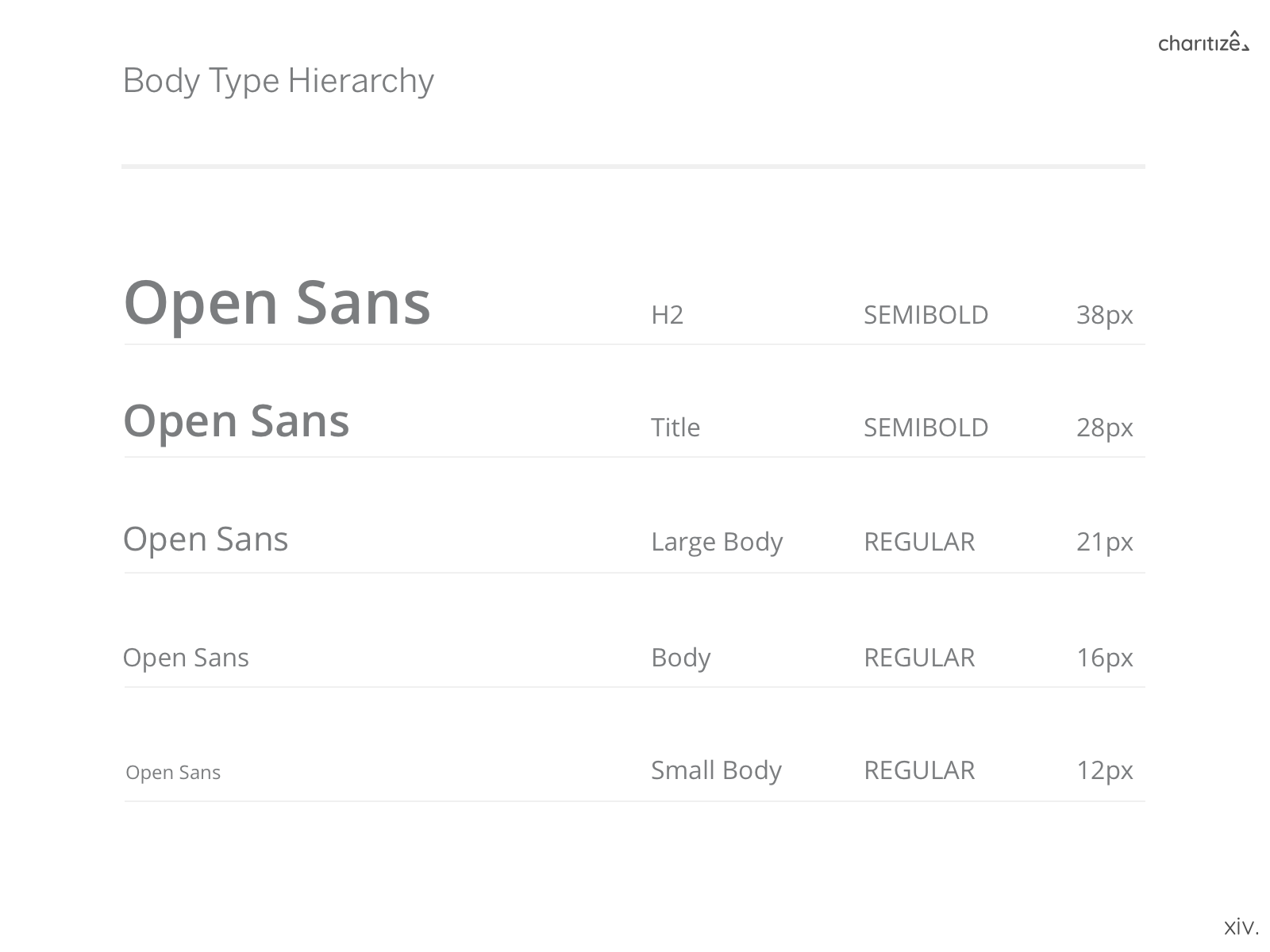
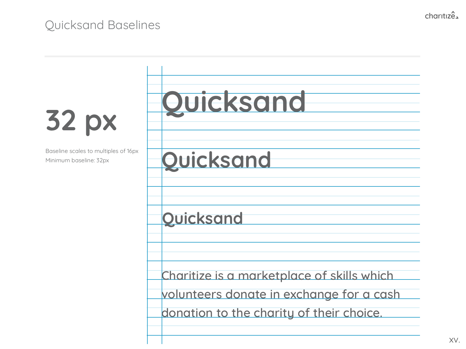
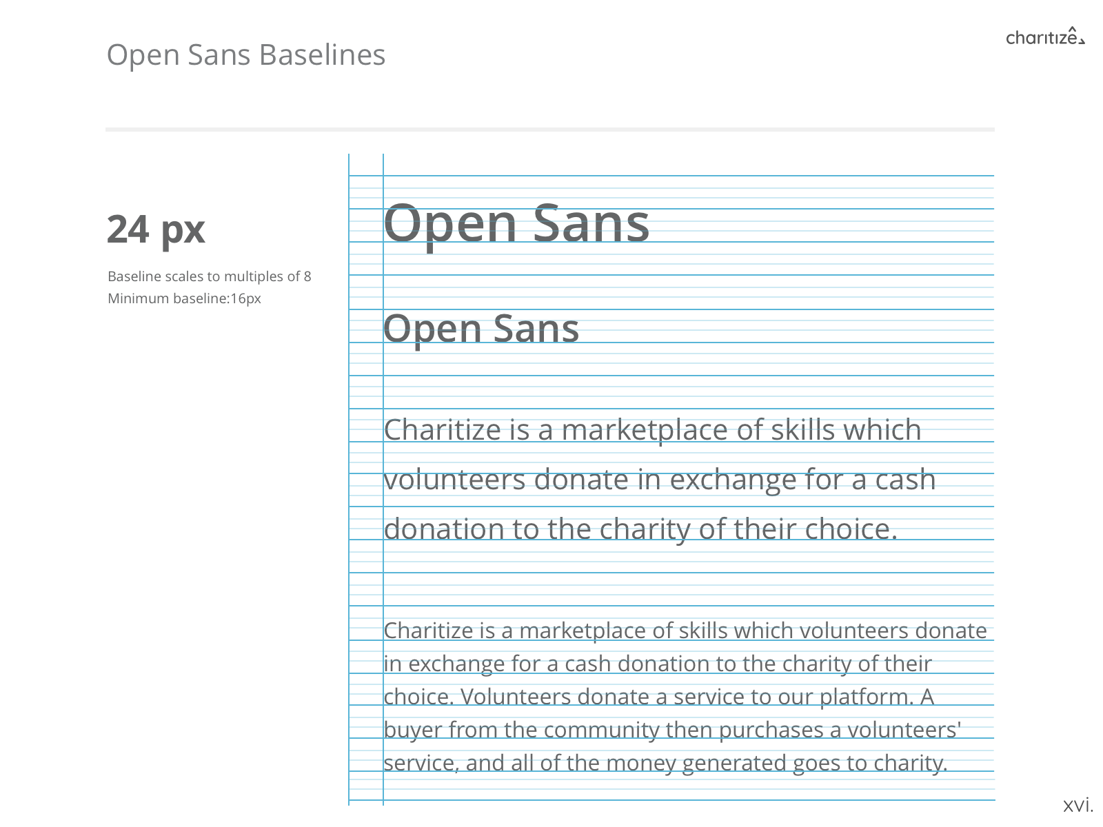
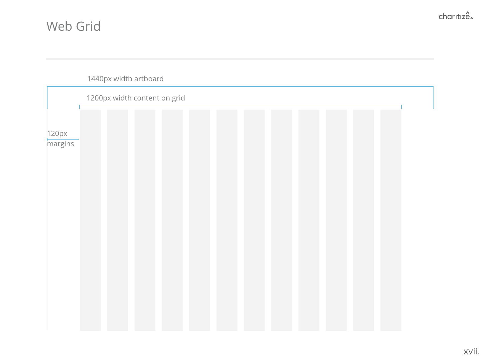
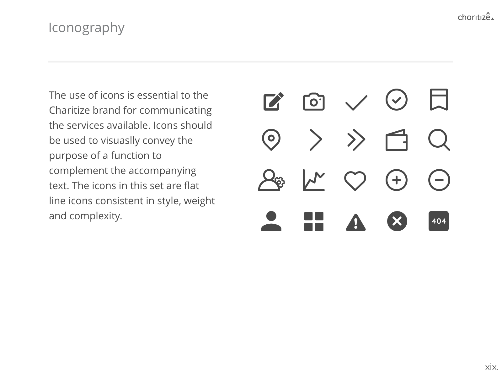
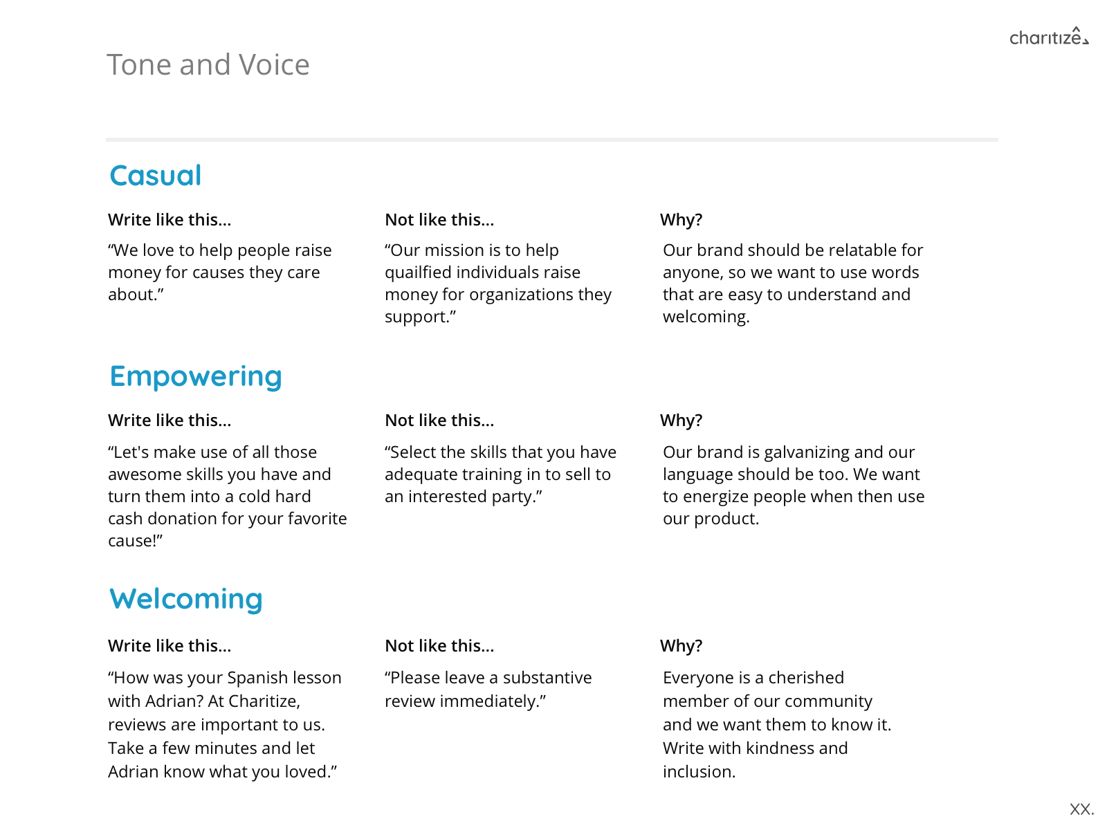
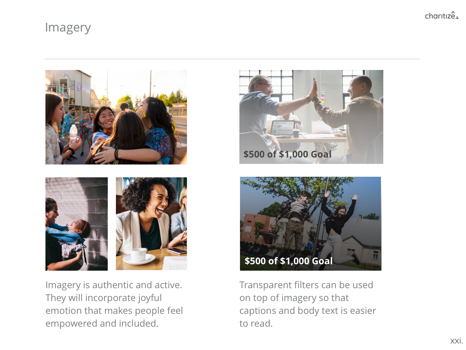
BRAND GUIDE
USER RESEARCH
VOLUNTEER & DONOR INTERVIEWS
We began reaching out to people who were part of a community and had volunteered their time/services or donated within the past 6 months. Our goal was to learn their motivations, behaviors, pain points and the channels they used to interact with their communities. Here are the main insights we gathered after 20+ interviews:

COMPETITOR ANALYSIS
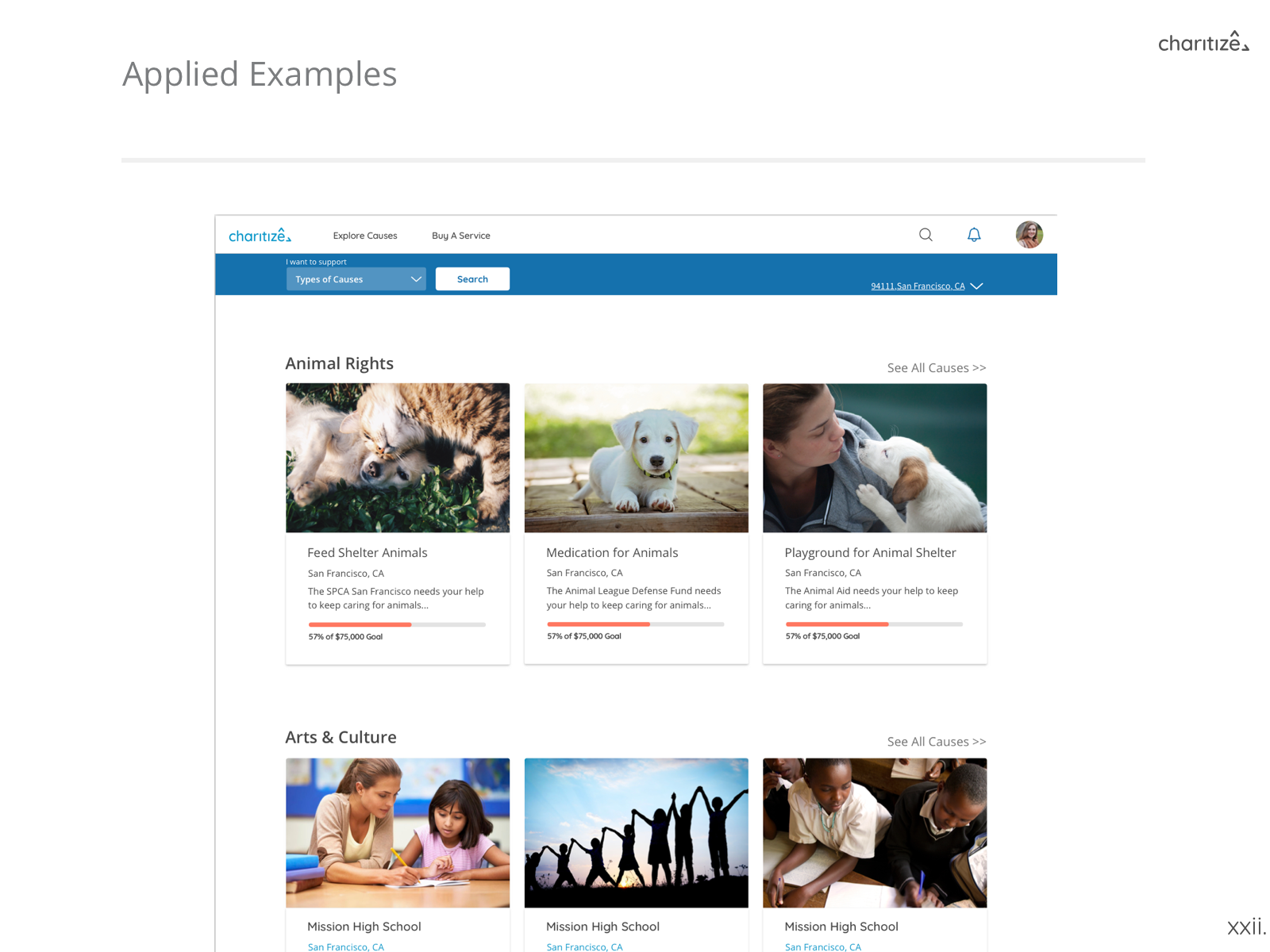
We began research on existing companies that had multiple stakeholders, both in the fundraising and consumer industries. After going through 23 companies, we began picking out patterns and features that worked well and could be incorporated into our designs.

DESIGN
LO-FI
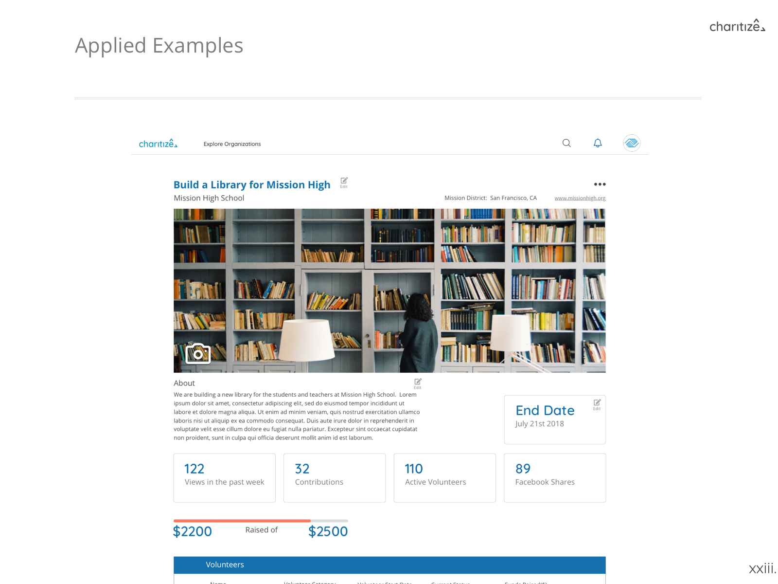
Splitting off into teams based on the three stakeholders, I led a team in designing the profile pages for Organizations/Charities and Causes (specific initiatives such as building a library, for example). This included building out the private and public views, and what type of information to include or exclude. With the insights we gathered in the research phase, my team also had to take into the account the following:
- Do we want to include a dashboard and what kind of metrics should be tracked?
- What types of features should does an Organization need to see in private view?
- Should a list of volunteers be made accessible?

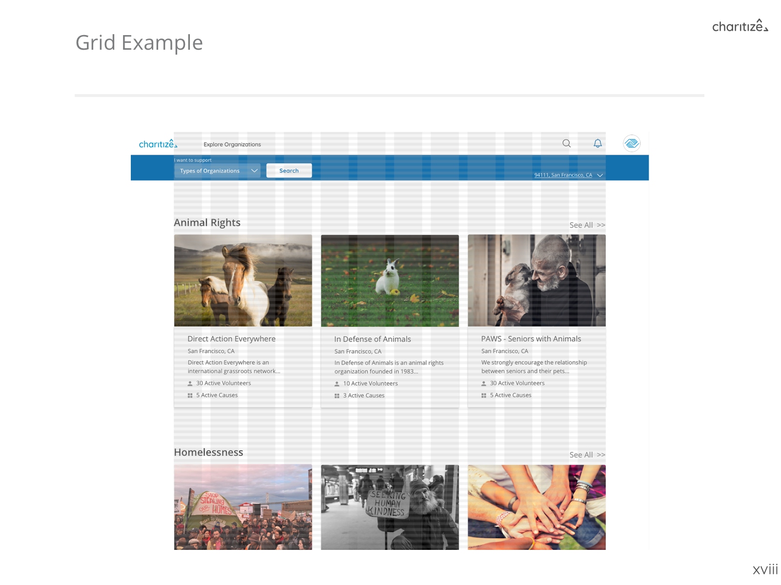
Organization Page Public

Organization Page Private

Cause Page Public

Cause Page Private
HI-FI
At this point, the branding team began to collaborate with the rest of the UX team to ensure that there was a visual consistency across all flows. We first handed off completed mockups of the landing pages to the team as a guideline for color and spacing between each component. On my pages, I worked on a few iterations to include in extra features for editing in private view while rearranging the layout to create a stronger visual hierarchy.

CONCLUSION
NEXT STEPS
The founders were very pleased with the final prototype and handed off all the files to their engineering team. Charitize is looking to fully launch in 2019.
FINAL
THOUGHTS
This was one of the largest projects I had the privilege of working on and it was extremely gratifying to see close to 180+ screens come together in the end. We all enjoyed working with the founders as they were deeply invested in their product and vision which pushed us to work even harder. Personally, I learned the importance of visually brainstorming all of our ideas. It sounds obvious, but working with a product that had three stakeholders there were a lot of times we spent just ideating aloud without picking up a pen. Documenting each of our design decisions created a strong foundation to move forward as a team.
Legion Charitize Udacity First Derm Songkick
